← All case studies
Northwind Bank
·
Web app
·
2022
Checkout redesign
A three-step checkout that a third fewer people abandon.
Checkout — 1440

Web app
The 30-second version
0:30 read
Role
Product designer, checkout lead
Team
1 PM, 4 engineers, 1 researcher
Timeline
10 weeks
Platform
Web app
Problem
Nearly half of shoppers left the bank's card checkout before paying, most of them on the address step.
−32%
checkout drop-off
−41 s
median time to pay
+2.1 pts
satisfaction score
01 Context
Northwind's card checkout lost 45% of shoppers between basket and payment. Support tickets blamed the address form, which asked for the same details twice.
02 Research
I watched 12 people pay for something real and read 400 drop-off sessions. 9 of 12 stalled on billing address. Nobody read the fee line.
03 Decisions
We cut the billing step to a postcode check. Fraud flags rose 2%, so we kept a full address form only for new cards over 5,000 SEK instead of for everyone. The fee moved next to the total, in the same size.
04 Result
Drop-off fell from 45% to 30.5% in six weeks, the median time to pay dropped by 41 seconds and the support tickets about addresses halved.
Screens
Screen 01

1600 × 1000
Screen 02
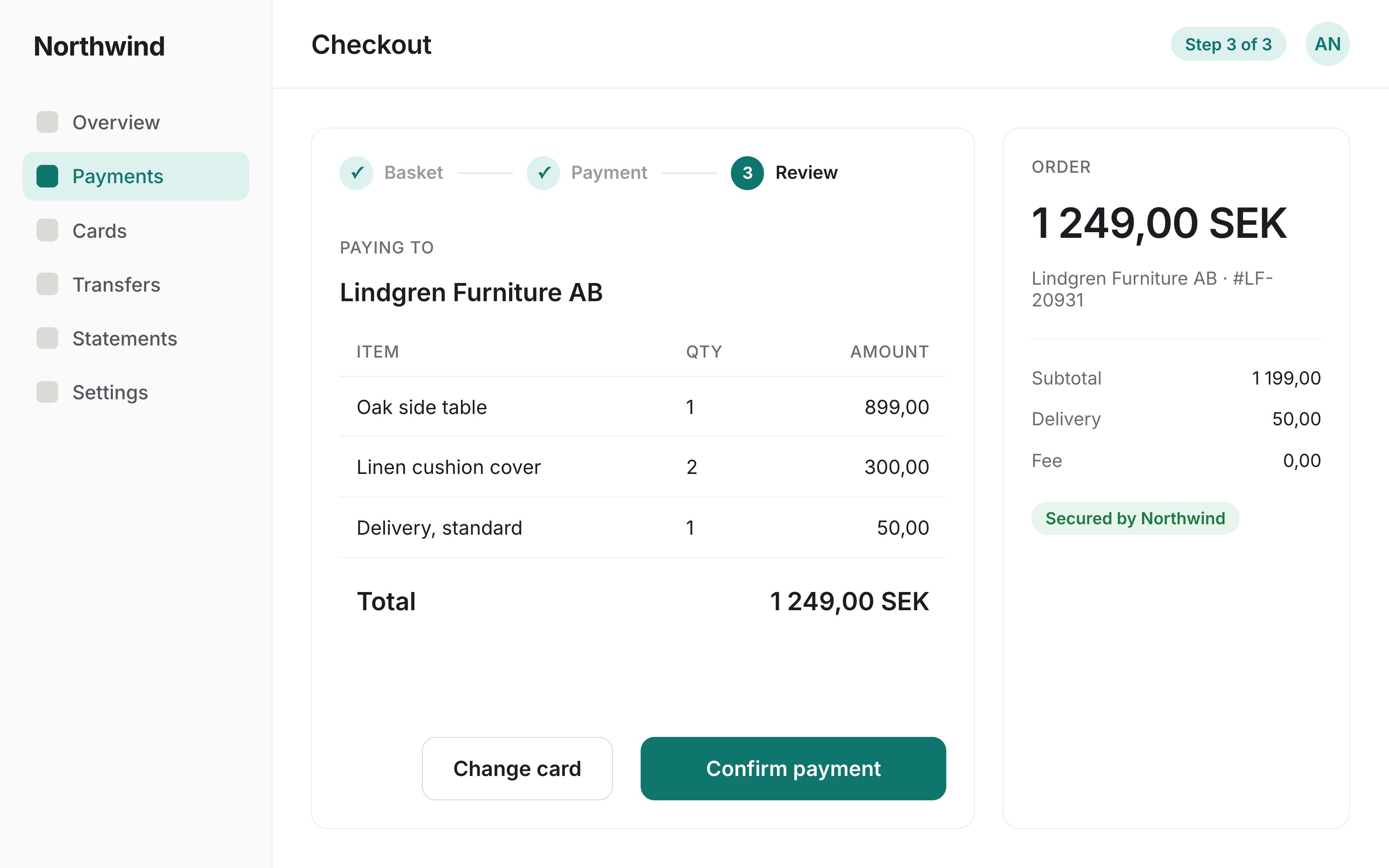
1600 × 1000
Screen 03

1600 × 1000
Screen 04

1600 × 1000
Next
More case studies.

All case studies →