← All case studies
Kelp Payroll
·
Design system
·
2024
Kelp design system
One button, three variants, and a team that stopped arguing.
Button — component
Design system
The 30-second version
0:30 read
Role
Product designer (contract)
Team
2 designers, 3 front-end engineers
Timeline
6 months
Platform
Design system
Problem
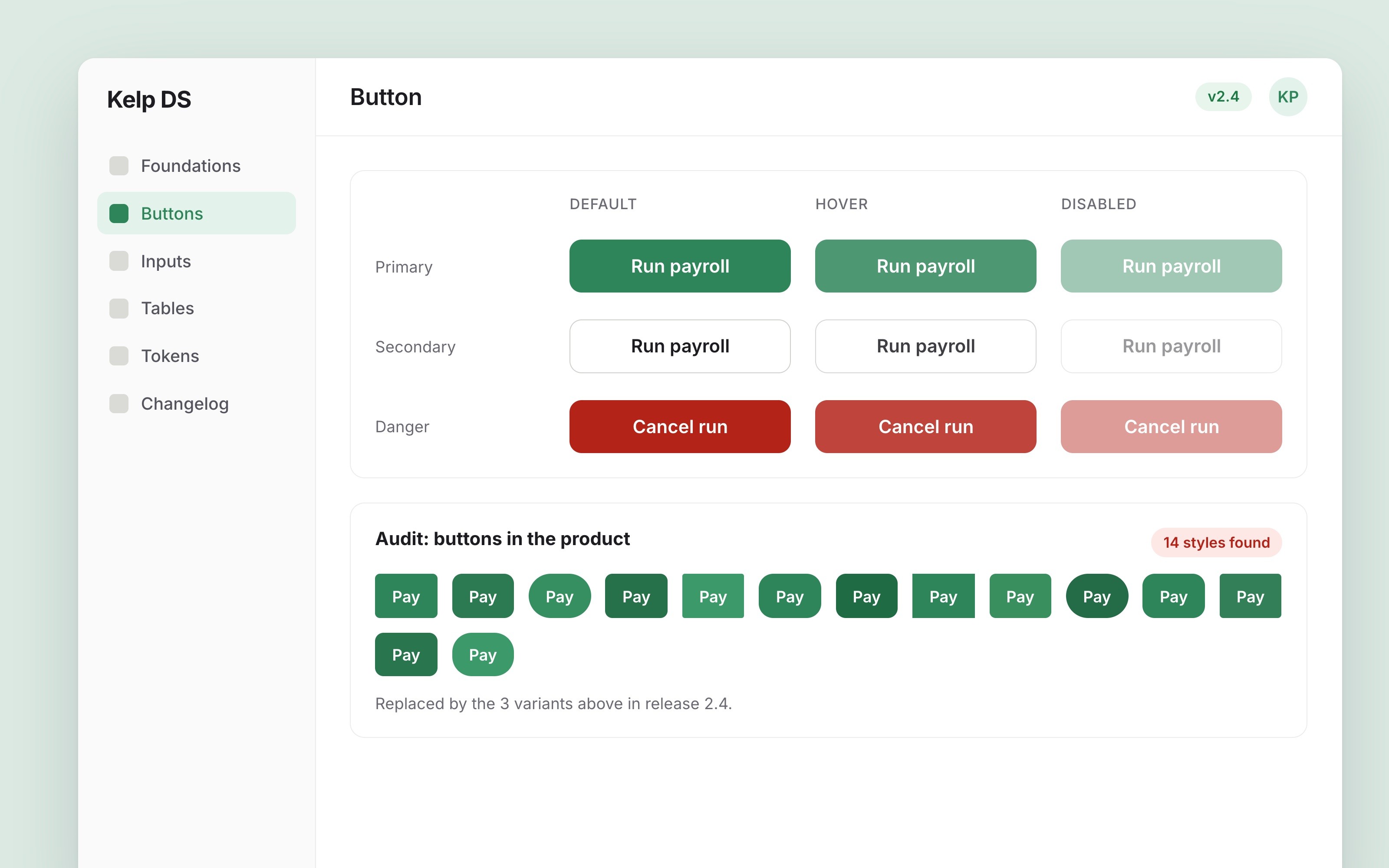
Payroll screens used 14 different button styles, so every new feature started with a debate.
14 → 3
button styles
−35%
UI review time
92%
screens on tokens
01 Context
Kelp had grown from 4 to 40 people in two years. Its payroll app had 14 button styles, 31 greys and no shared library.
02 Research
I screenshotted every screen, 212 of them, and grouped what I found. Most differences were accidents, not decisions.
03 Decisions
We shipped tokens first and components second, so teams could adopt colours before rebuilding screens. That was slower to show, but nobody had to stop feature work.
04 Result
Button styles went from 14 to 3, UI review time dropped by about a third and 92% of screens now use the tokens.
Screens
Screen 01

1600 × 1000
Screen 02

1600 × 1000
Next
More case studies.


All case studies →